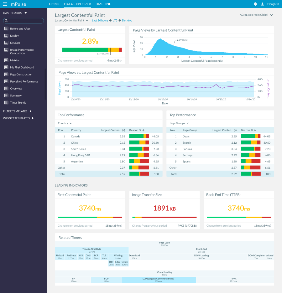
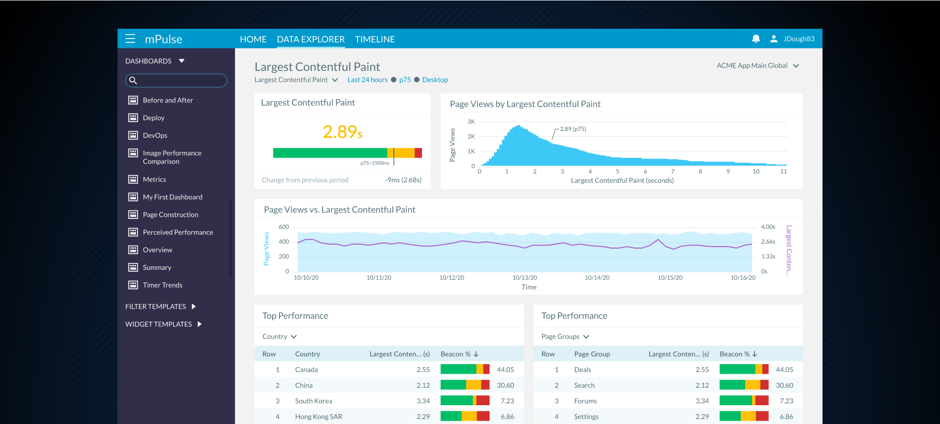
mPulse Data Explorer
Dynamic Navigation for KPI Dashboards
I redesigned a complex enterprise dashboard to improve user experience and increase productivity. The challenge was to simplify a feature-heavy interface while maintaining all necessary functionality for power users.
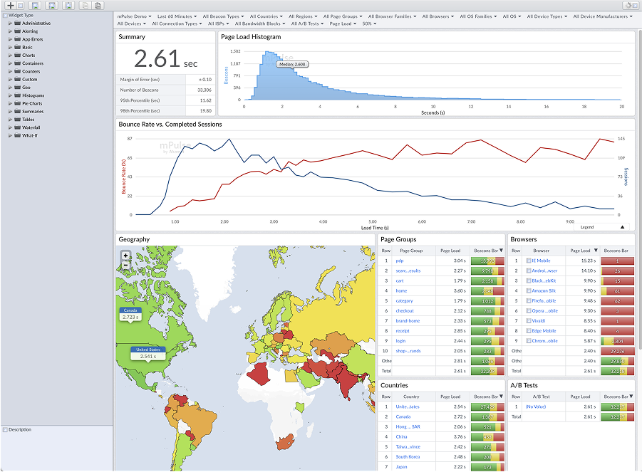
mPulse captures real user monitoring (RUM) data, showing valuable key performance indicators (KPIs) that help engineers optimize website performance, gain visibility into user behavior, and measure ROI. Data explorer is a series of dynamic dashboards that allows a user to quickly navigate through related data points to gain insight on the performance of their site.
Solution
To ground the redesign in both business goals and user needs, I conducted extensive interviews with key stakeholders. These conversations uncovered not only the pain points in the existing dashboard but also clarified expectations for how the new system should function. Because the effort was part of a larger, full-scale product redesign, I also explored modern, industry-standard approaches to dashboard and widget design, ensuring our work would align with best practices. Through multiple rounds of iteration and feedback, we synthesized stakeholder input with contemporary design patterns—ultimately shaping a solution that balanced business requirements with a more intuitive, future-ready user experience.
Key deliverables:
- Modernized interface design
- mplemented dynamic widget navigation allowing users to drill down into related data and uncover key insights (e.g., KPI metric correlations)
- Streamlined layout Creation
- Positive user feedback